Company
Psyd’s Soups (Course Project)
Role
Brand Design
UI/UX Design
Graphic Design
Web Development
User Experience
Brand Guidelines
User Research
Asset Creation
Product Mockup
Logo Design
Typography

As the lead designer overseeing branding and communication for Psyd’s Soups, a conceptual soup restaurant nestled in the Colorado mountains, my role is to translate our vision into a cohesive and compelling identity.
Psyd’s Soups embodies a commitment to freshness and authenticity, sourcing ingredients directly from local farms and businesses. Housed within a renovated industrial factory turned cozy diner, this venture aims to evoke a sense of rustic charm and homeliness with each culinary experience.
Through meticulous research and strategic design choices, I endeavor to bring this narrative to life, ensuring that every aspect of our branding and product design resonates authentically with our concept and ethos.
Research & Preliminary Sketches
Part 1
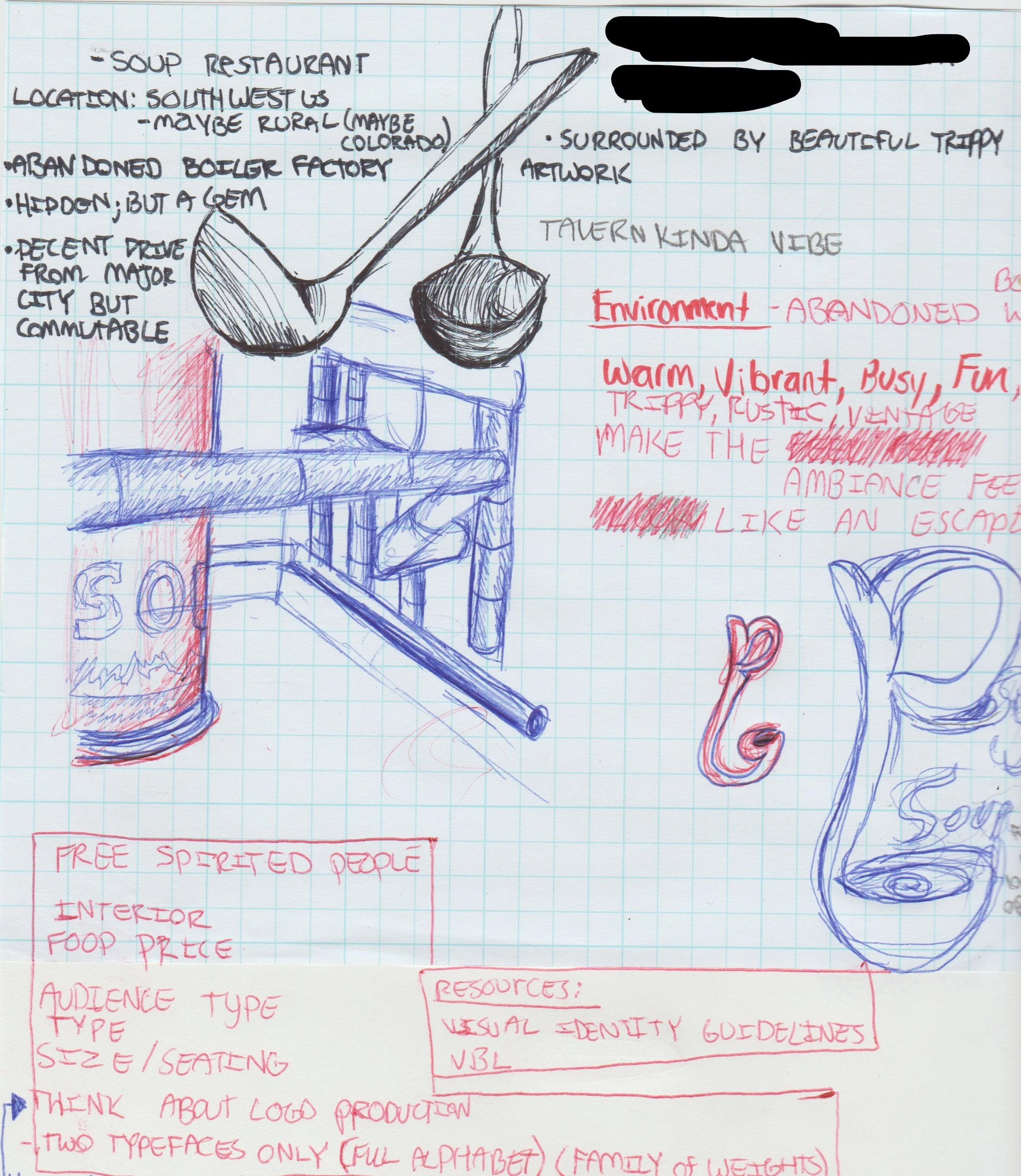
Scanned in photo of restaurant brand planning and ambiance
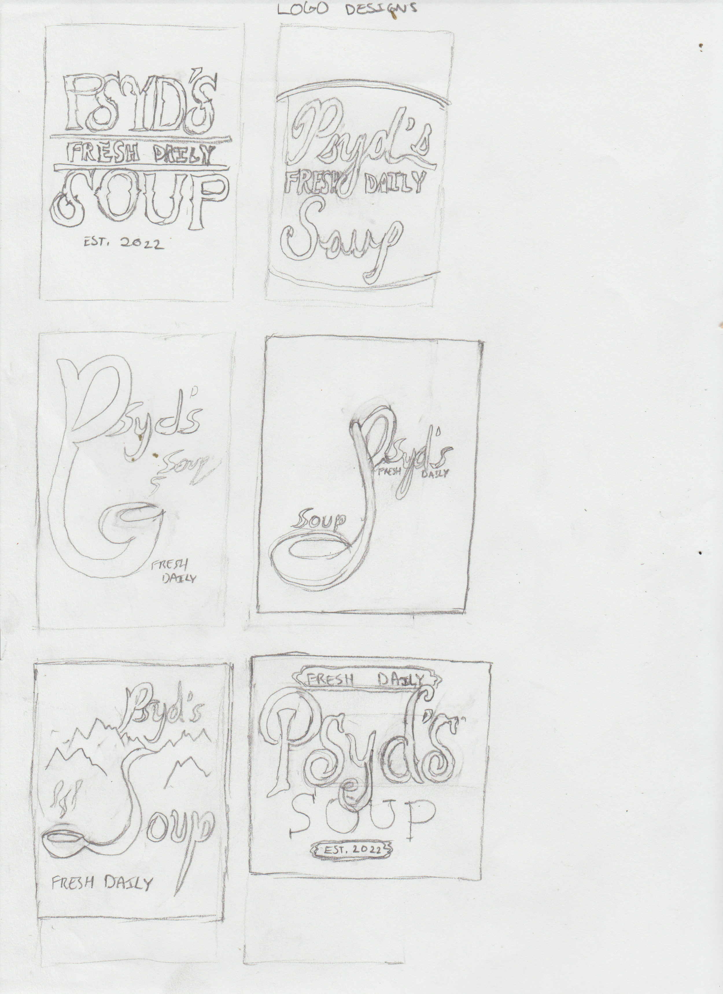
When I was initially creating the designs for the restaurant, I wanted to include influence from soup kitchens. My plan for this was to include the old style of soup cans like Campbell Soup, and a very common tool for serving soup dishes; the soup ladle.
Original Logo Sketch Designs
Logo Design
Part 2
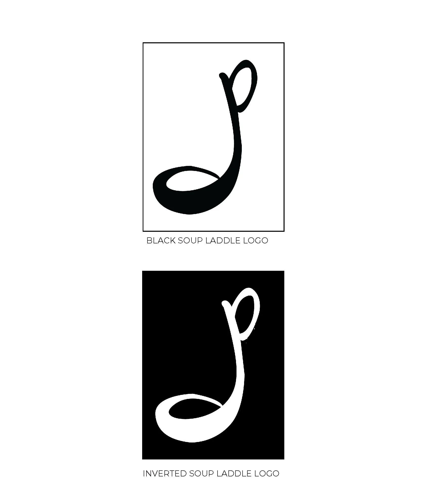
Illustrator Black & White Logo Variations
-

Illustrator Logos Version 1
These were the first logo designs I did in Adobe Illustrator. A primary emphasis for these designs was showing the “Fresh Daily” tag and also showcasing the fact that it is a soup restaurant.
-
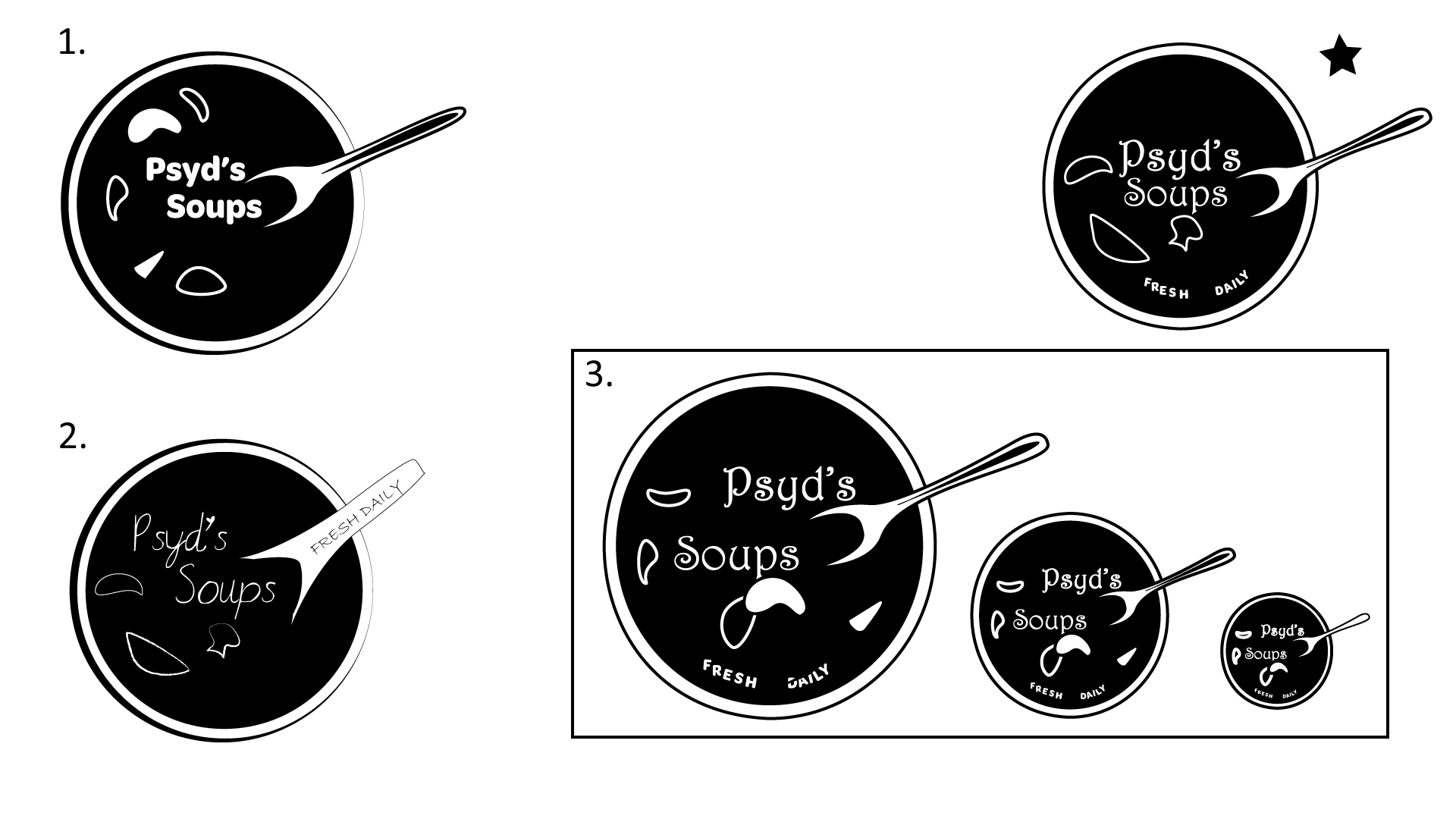
Illustrator Logos Version 2
This version of logos was one of the first sets of logos I designed. However, I did not end up going with this design.
Finalized Logo Decision
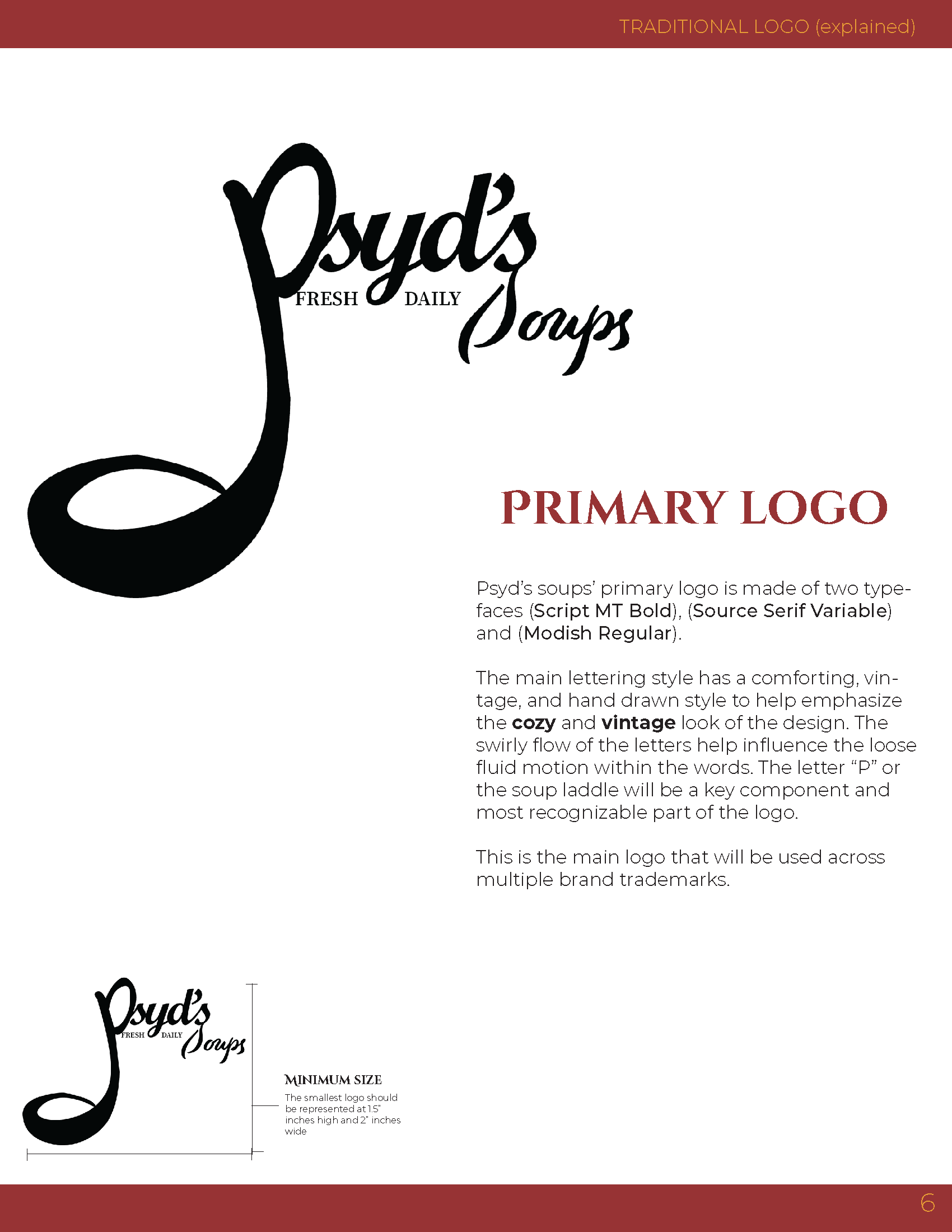
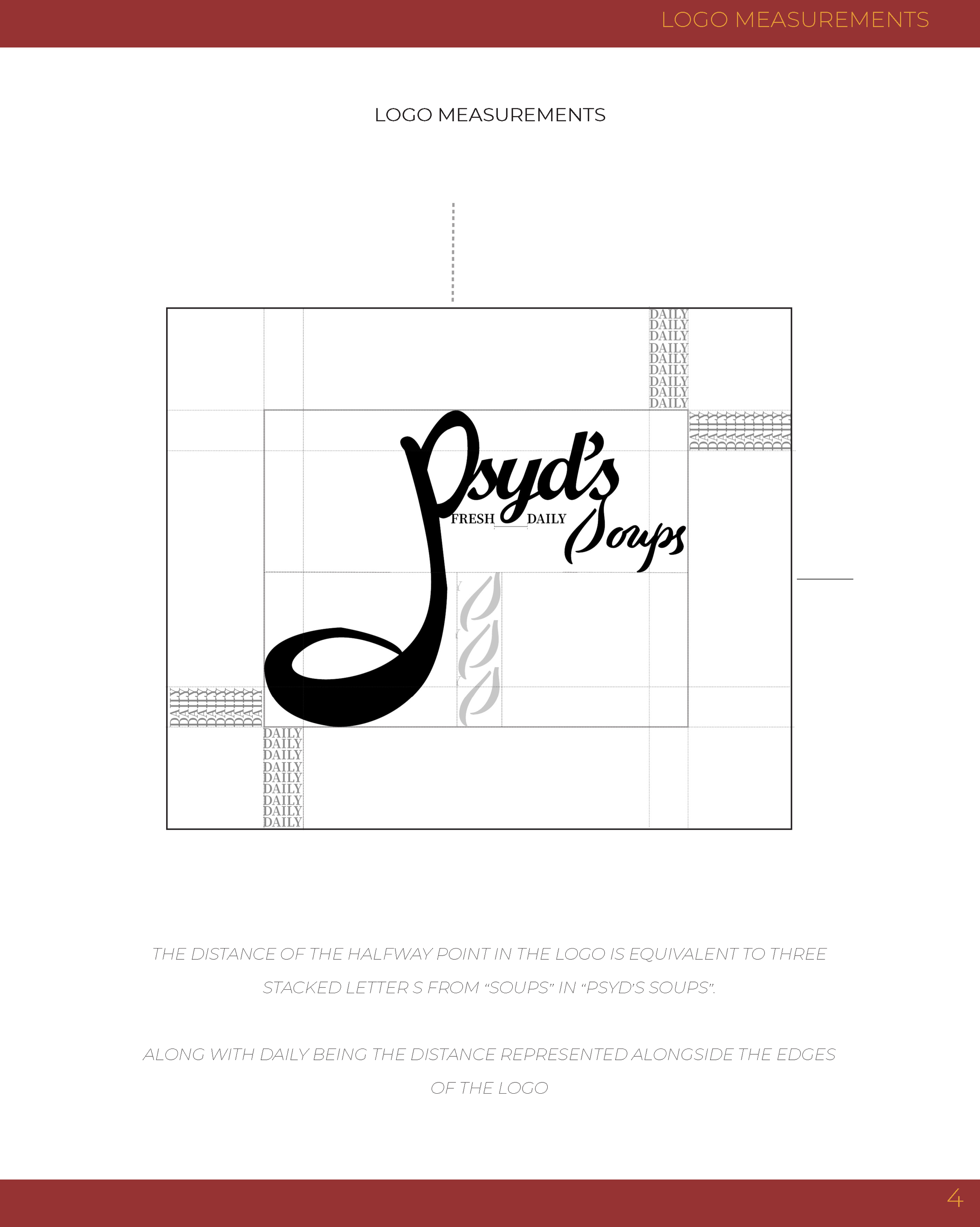
After thinking about the desired representation of the logo for Psyd's Soups, a concept embodying the essence of a warm and established soup kitchen. I identified the ladle as a pivotal element which is why it has such a strong emphasis in the design.
The typography and color palette were meticulously crafted to subtly convey the restaurant's ambiance and character, which ensured a cohesive and impactful visual identity.
Colors
Part 3
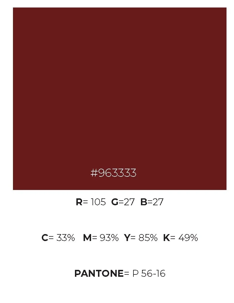
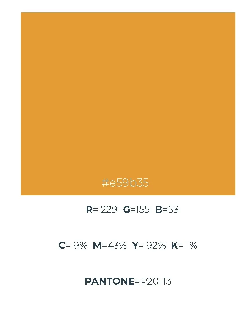
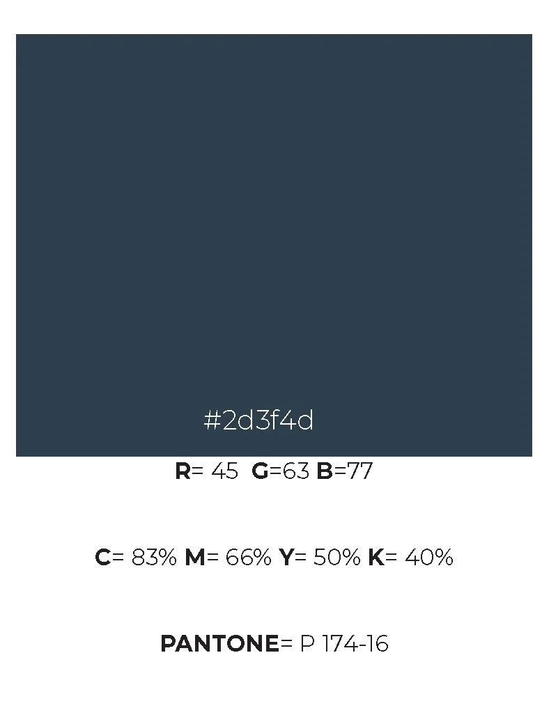
When deciding the color palette for Psyd's Soups, the intention was to encapsulate the essence of a warm, inviting, yet distinctly vintage atmosphere that defines the restaurant.
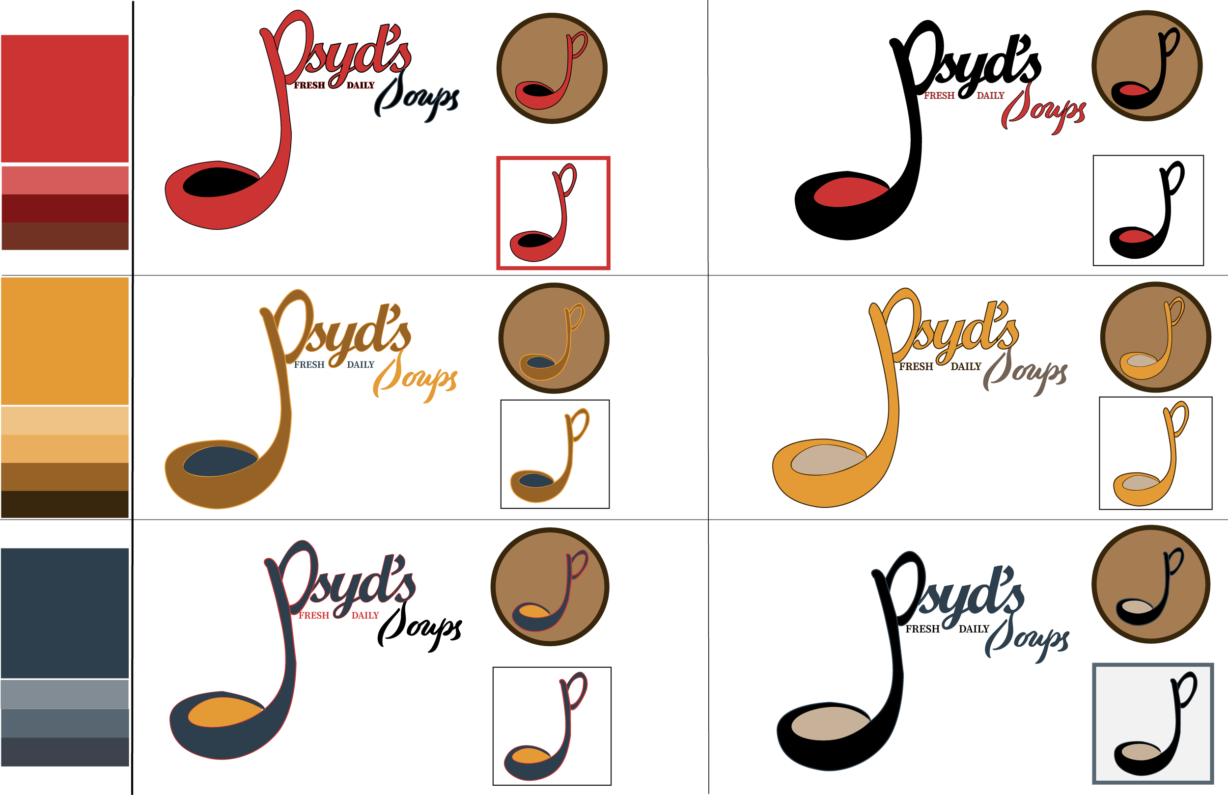
The chosen primary colors, a rich burgundy, vibrant mustard, and a deep navy blue, played an important role in achieving this aesthetic. This particular shade of burgundy serves not only as a bold statement of elegance and depth but also harmonizes beautifully with the yellow and navy blue, creating a palette that is both comforting and sophisticated.
Color Variations
This deliberate color selection is reflective of Psyd's Soups' dedication to offering an environment that is as warm and welcoming as the dishes served, ensuring that the visual experience aligns seamlessly with the brand's core values of homeliness and quality.
Typography
Part 4
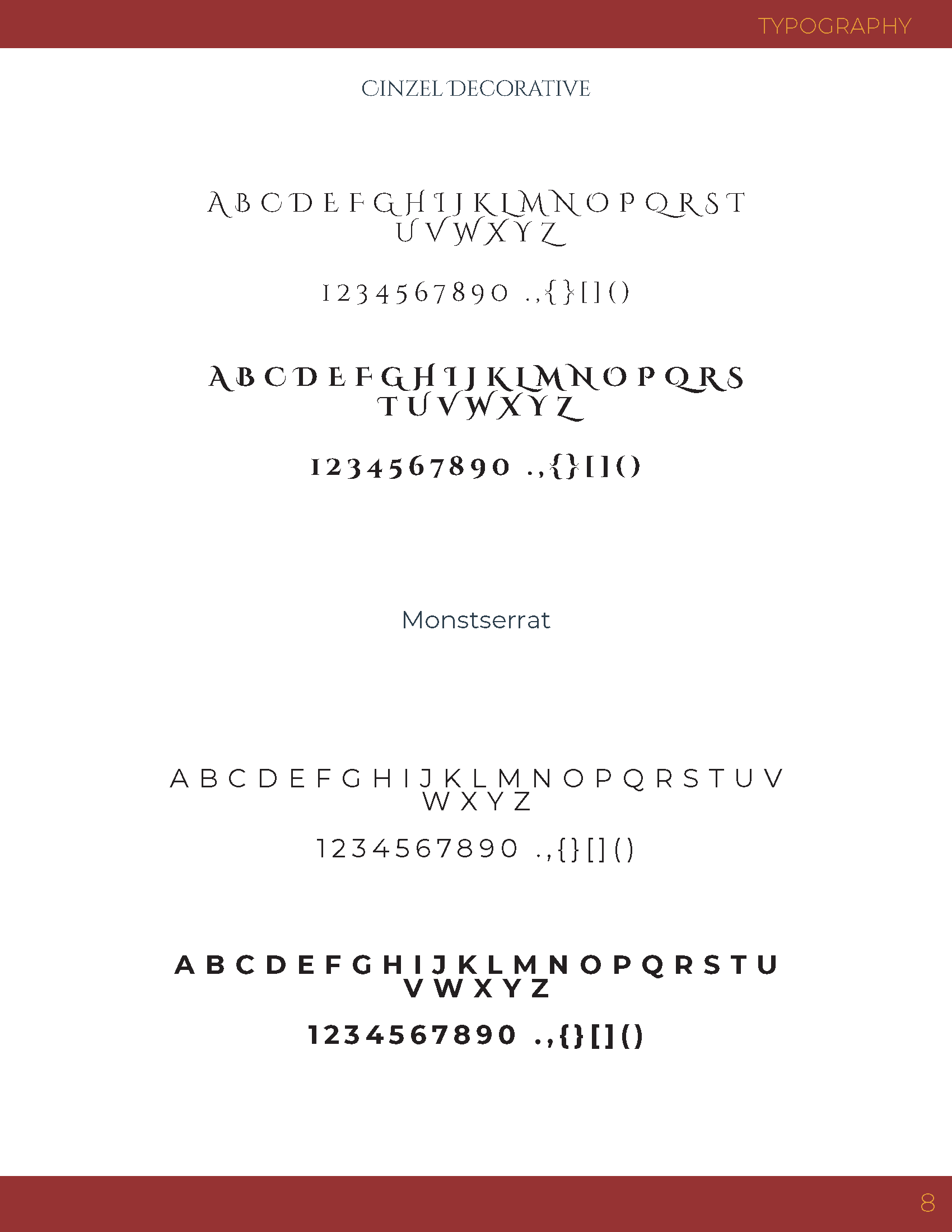
I wanted to make sure the typography resonates with the brand's ethos of warmth, coziness, and a commitment to the freshest ingredients.
Because that was my goal, the selection of Cinzel Decorative as the primary typeface was done with the intention of emphasizing the establishment's vintage charm, with its sharp, jagged edges evoking a sense of time-honored tradition and artisanal craftsmanship.
To complement this, Montserrat was chosen for its legibility, ensuring that menus and printed materials remain accessible and inviting to our clientele. This thoughtful pairing of typefaces not only enhances the aesthetic appeal of Psyd's Soups but also reinforces our dedication to creating a welcoming atmosphere where every detail contributes to a memorable dining experience.

Brand Product Mockups and Digital Assest

Part 5
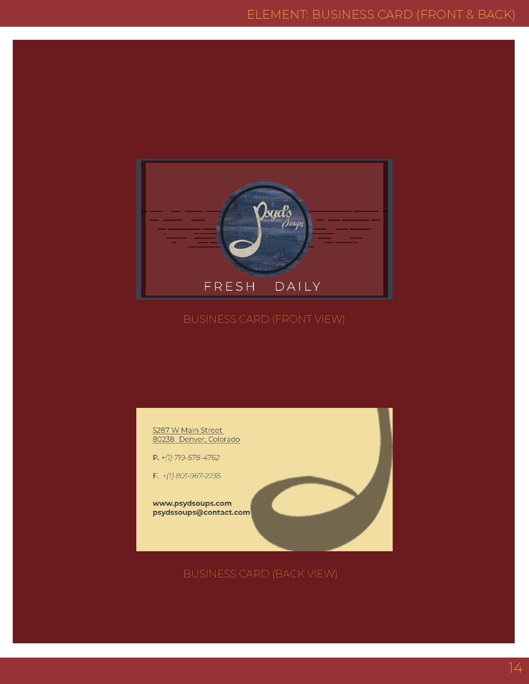
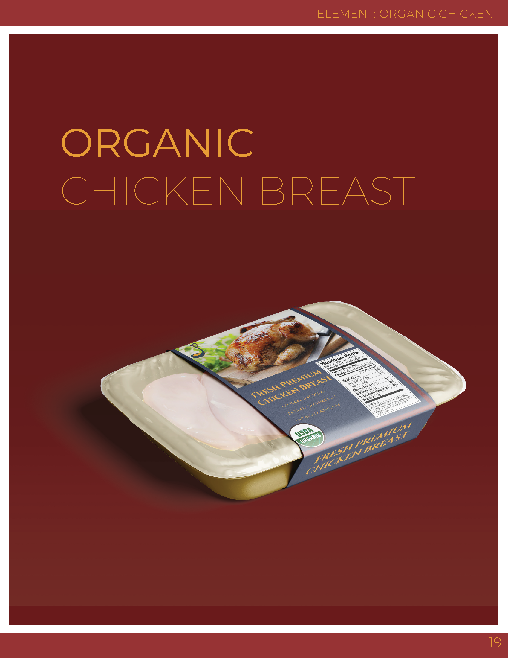
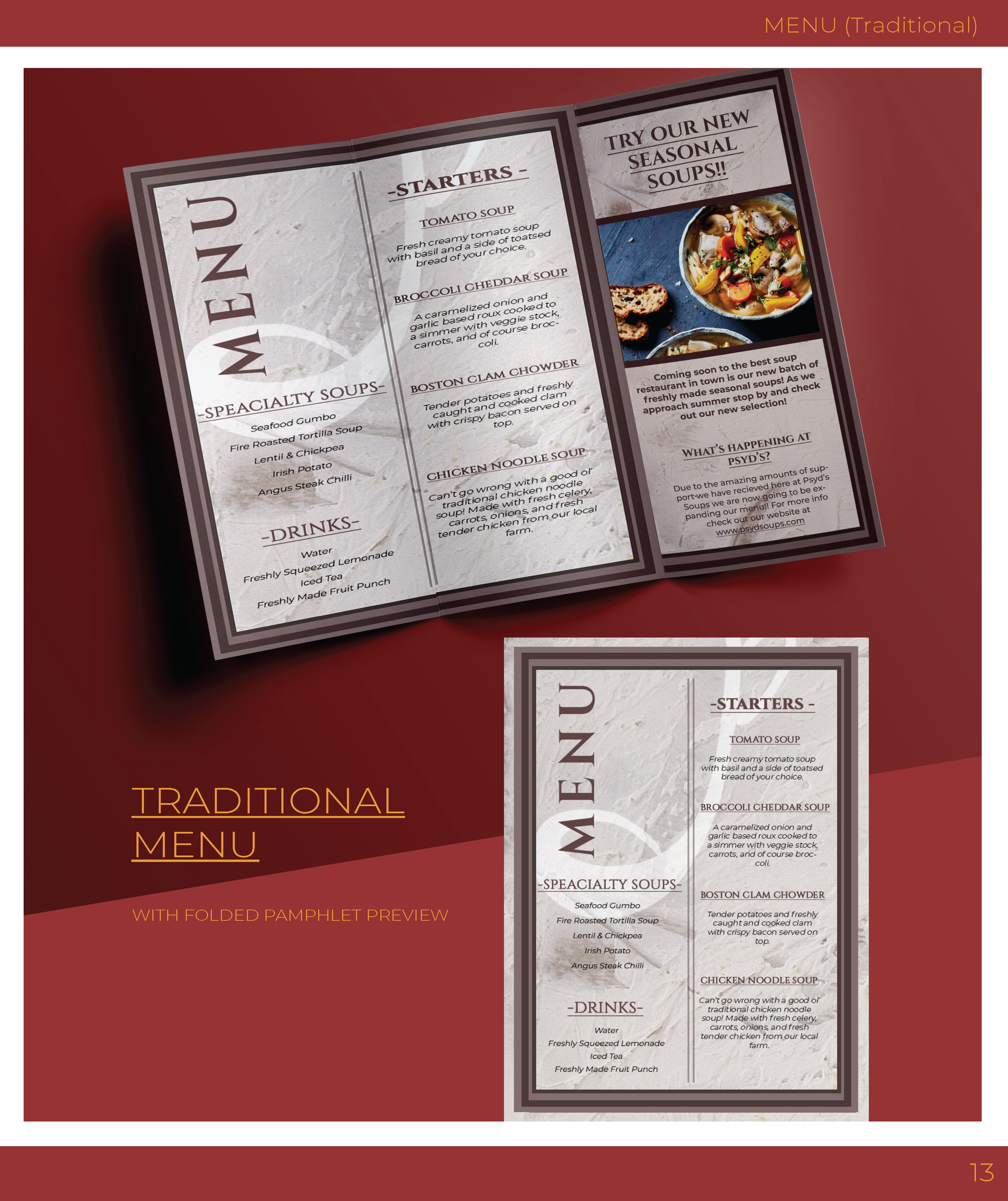
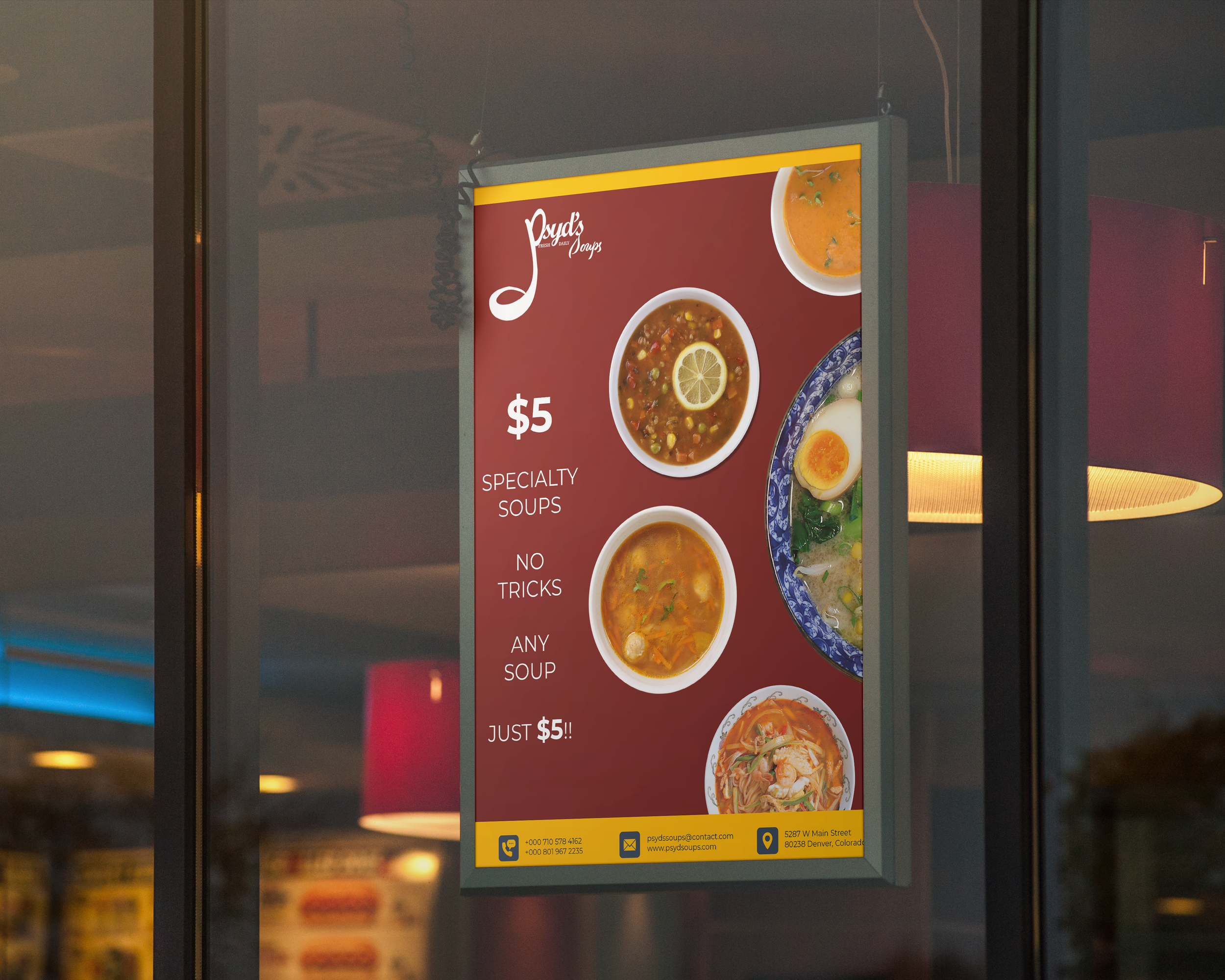
Product Mockups
Digital Assets

Email Template Design
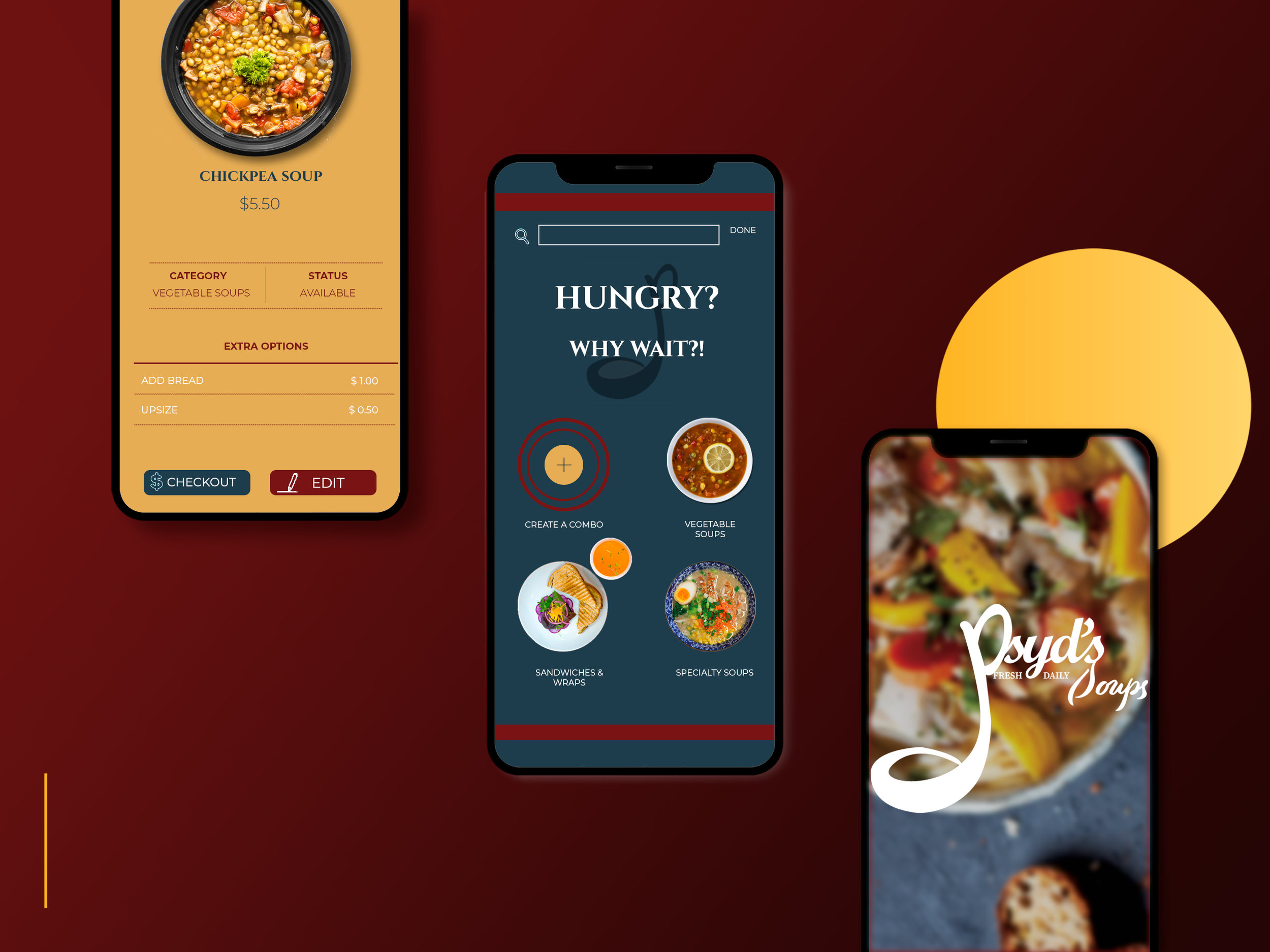
Mobile App Design
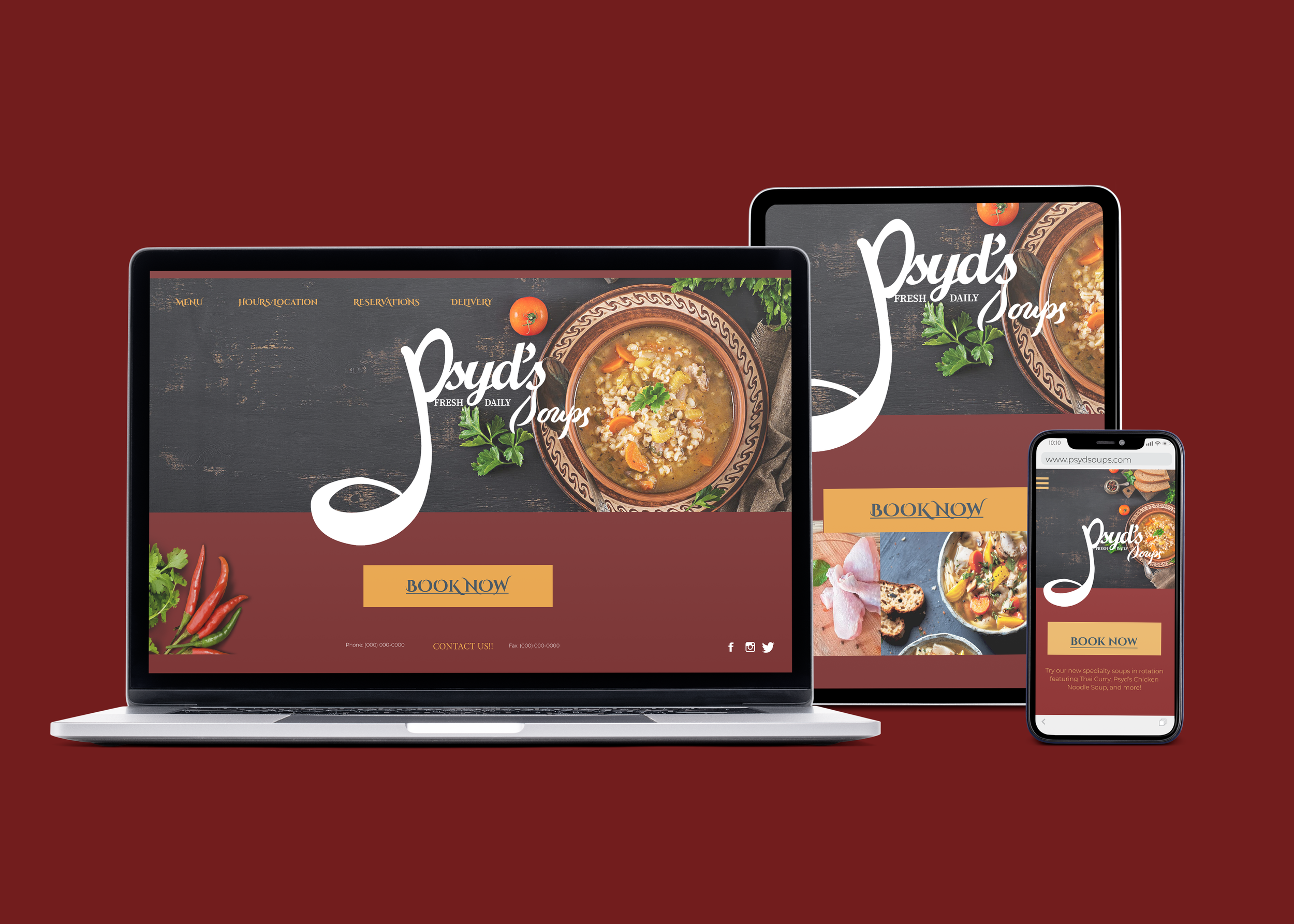
Website Design Template
Device Mockup
Reflection
Part 6
Reflecting on my experience with this project, I gained valuable insights into the intricacies involved in crafting a cohesive identity for a restaurant or business. Working on this concept restaurant provided me with the opportunity to weave narratives and evoke emotions through product, graphic, and environmental design. Balancing the needs of niche audiences with the creation of a welcoming atmosphere necessitated extensive competitive research and the exploration of user stories. This early project has provided me with a foundational blueprint for ongoing improvement and growth in my design career, igniting my passion for refining my skills and approaches moving forward.
Thank you for taking a look at my work! If you would like to see more product design projects click here.


